


Arashi is a japanese grill restaurant. For the logo I merged the traditional Japanese fan used in grilling with the iconic Japanese flag. "Arashi" means "storm" so that's also why I used the fan, in fact both of them can produce powerful winds.


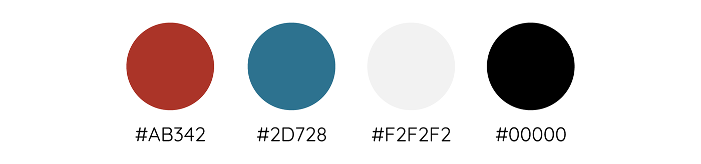
For the color scheme, I used a red color as a reminder of the Japanese flag and blue and grey colors to symbolize the sky and the winds.


As a nod to the traditional Japanese aesthetic, a carefully chosen Japanese font was utilized in this project. I think Masmuseh regular adds an authentic touch to the overall design.


For both the menu and the discount coupons, I tried to keep them minimal. When I think about Japan, and specifically Japanese food, I think of few and simple ingredients. That's what I want to communicate through the menu.

Presenting now the billboard design showcasing a visually captivating composition, featuring a prominent yakitori plate positioned on the far left, meticulously presented against a backdrop of a wind-inspired pattern. The inclusion of the phrase "we grill it, you eat it" on the far right serves as an informative and engaging element, underscoring the restaurant's approach. By highlighting the fact that the skilled chefs handle the grilling process, this design effectively communicates the establishment's differentiating factor from other dining establishments where customers typically grill their own food at tableside grills.


Despite the traditional facade, upon entering the restaurant, guests are greeted with a modern and sophisticated interior, complete with fancy plates and furniture, creating a unique fusion of traditional and contemporary elements.

The business cards use the main color of the brand and the pattern representing the wind.


